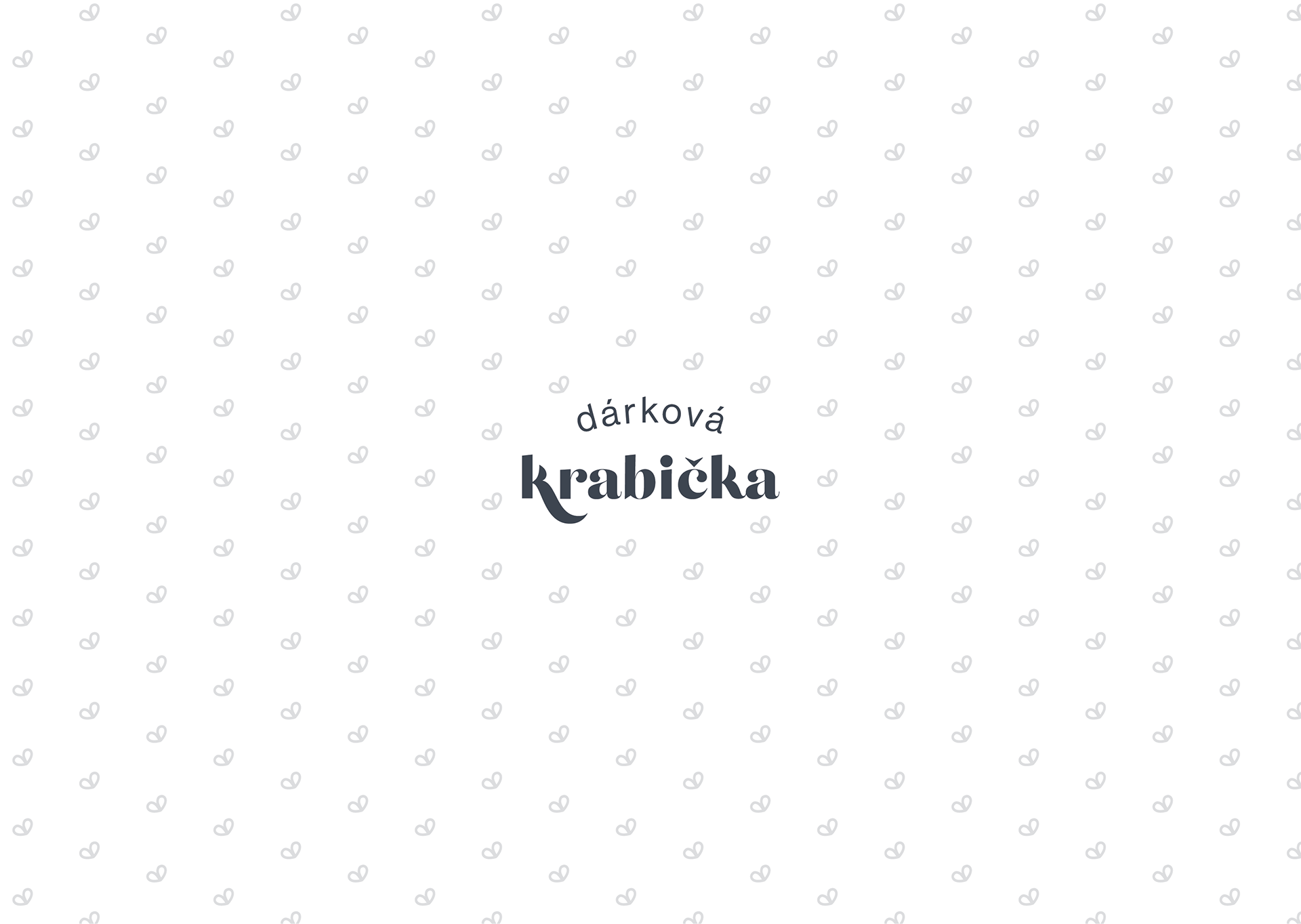
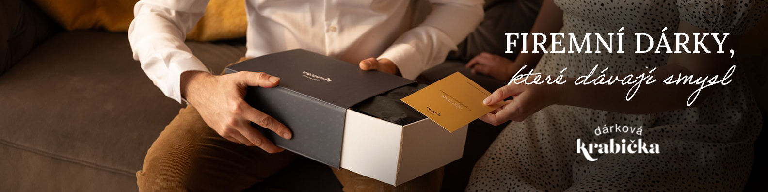
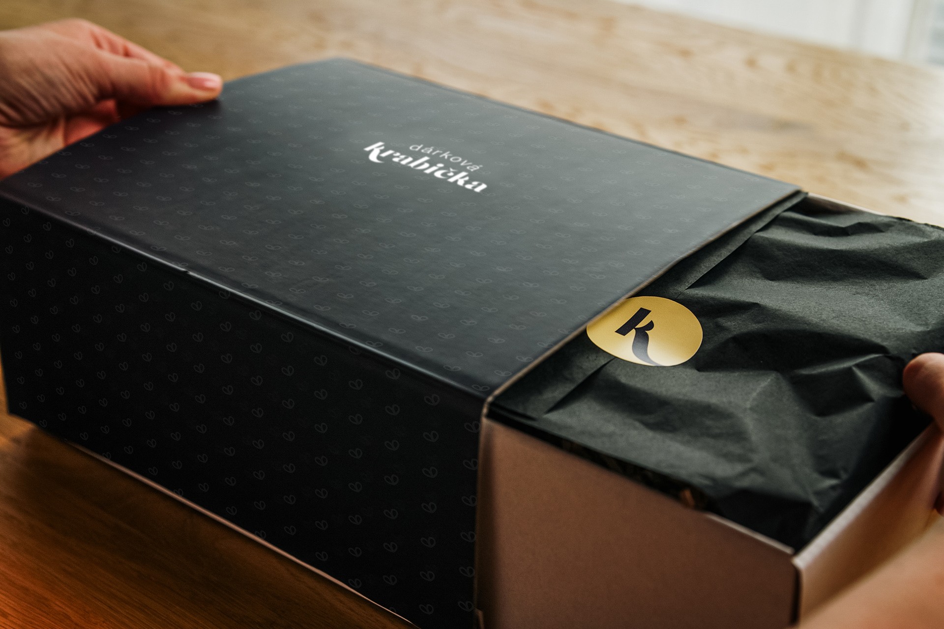
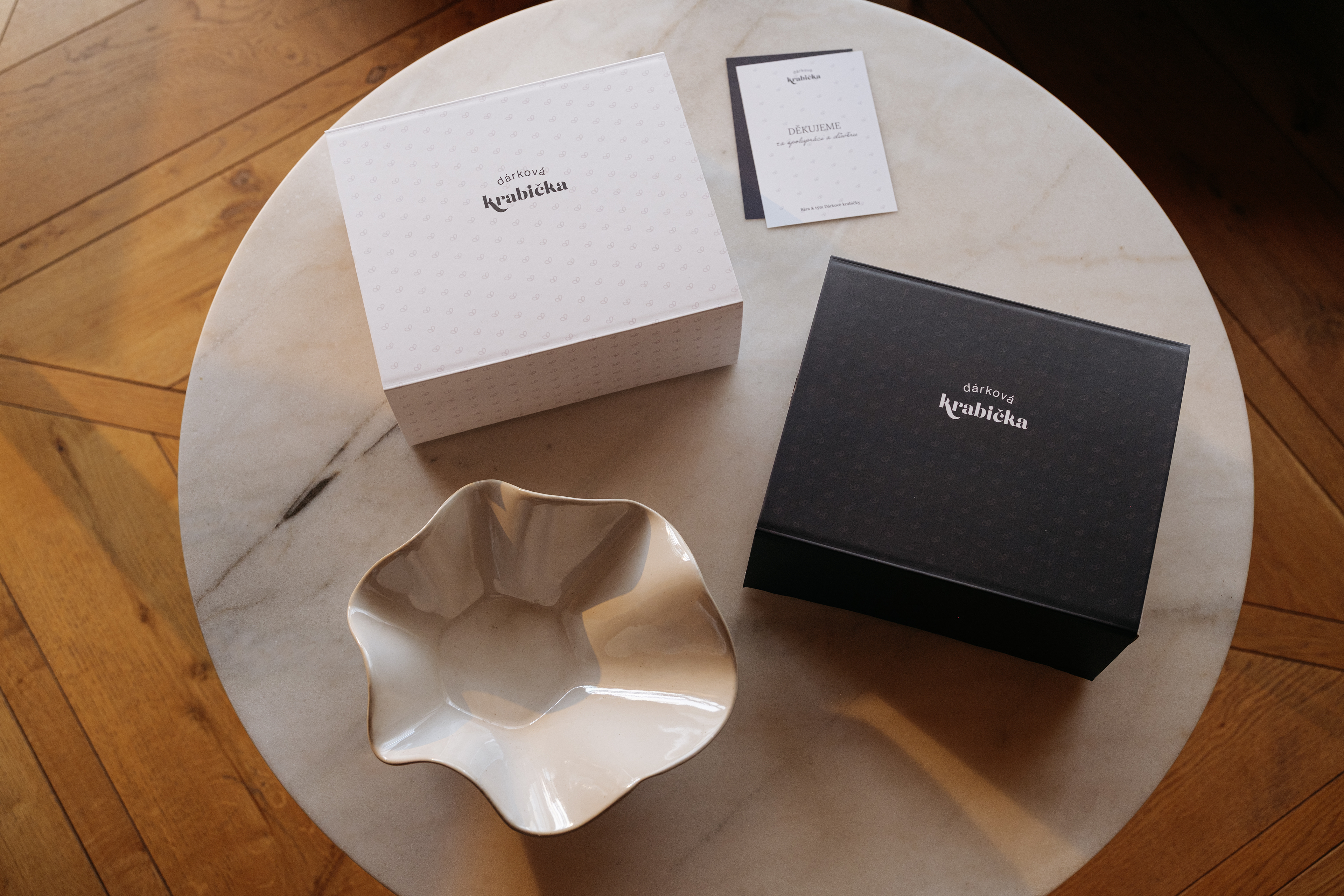
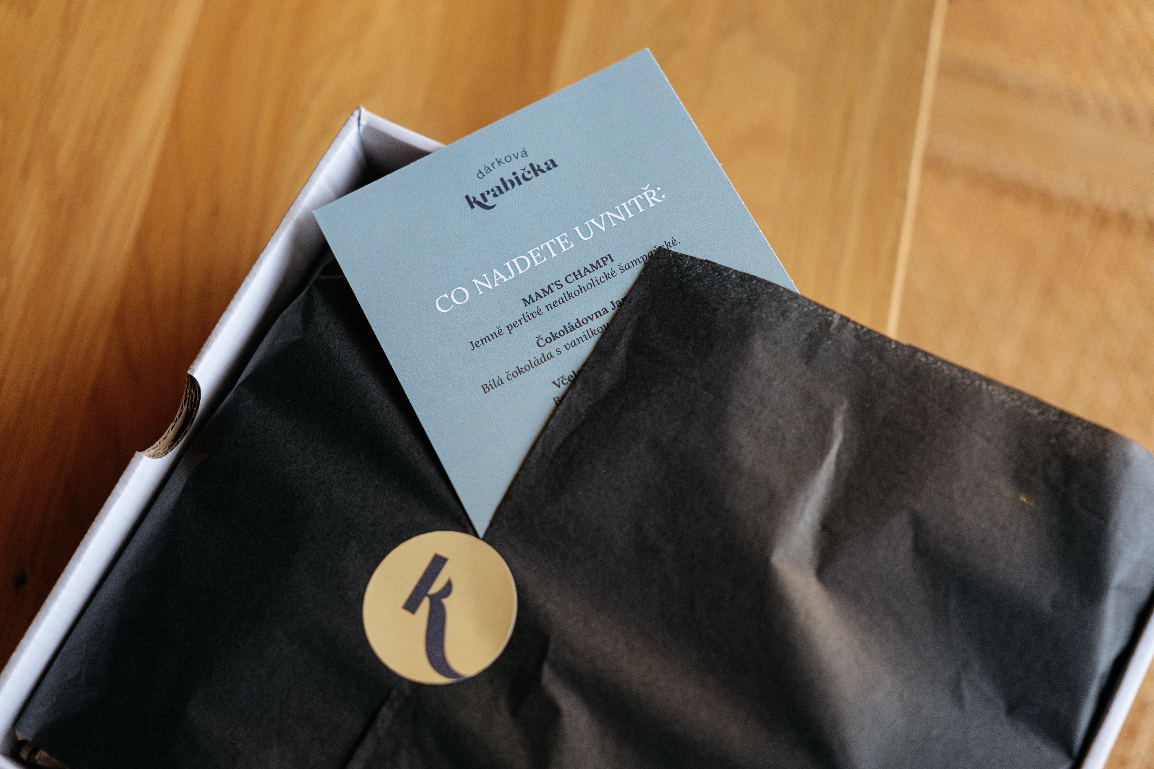
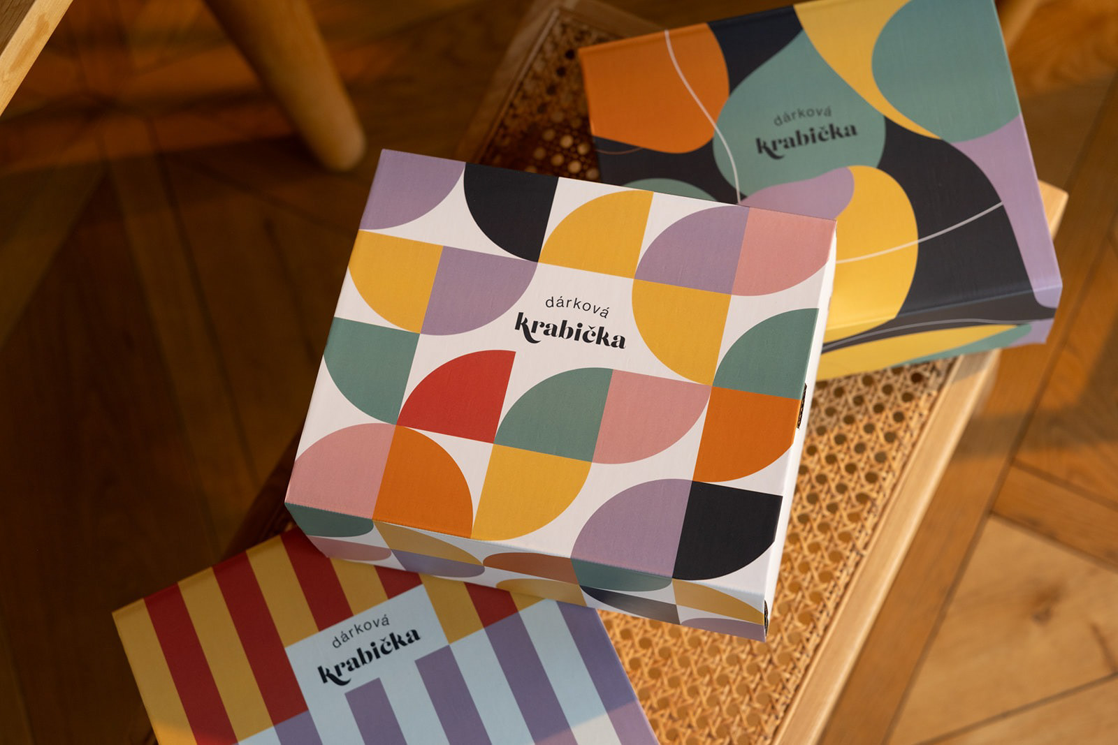
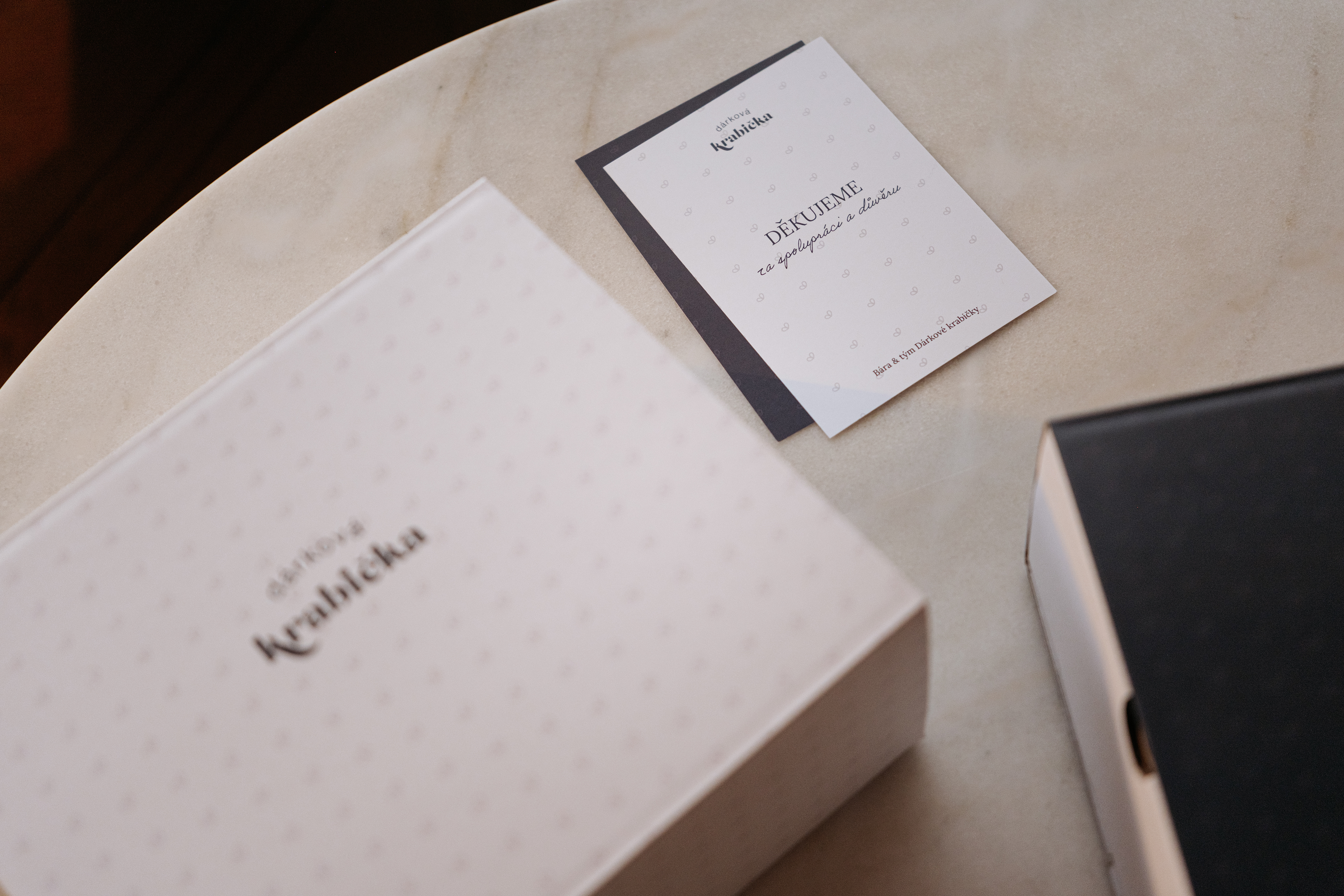
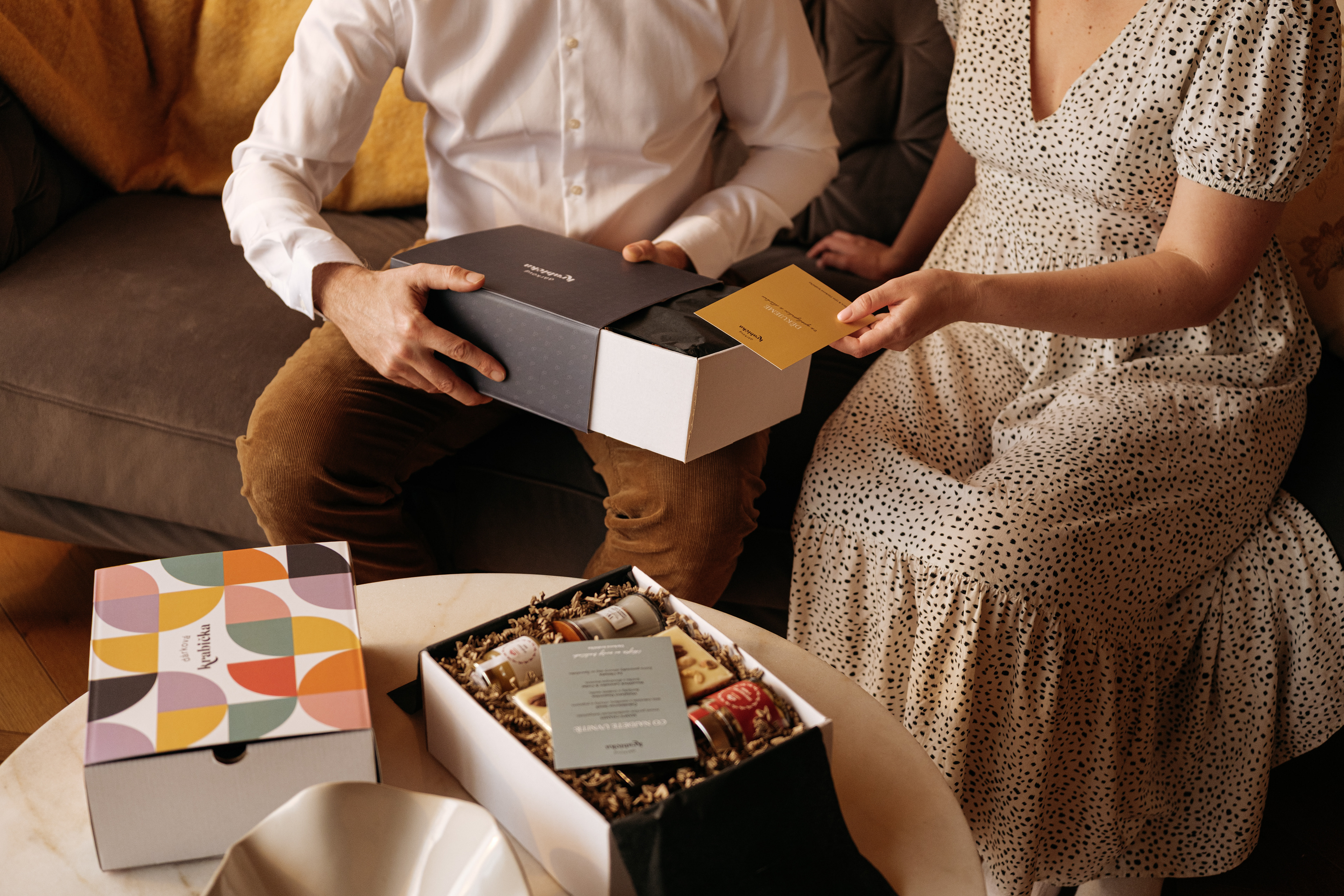
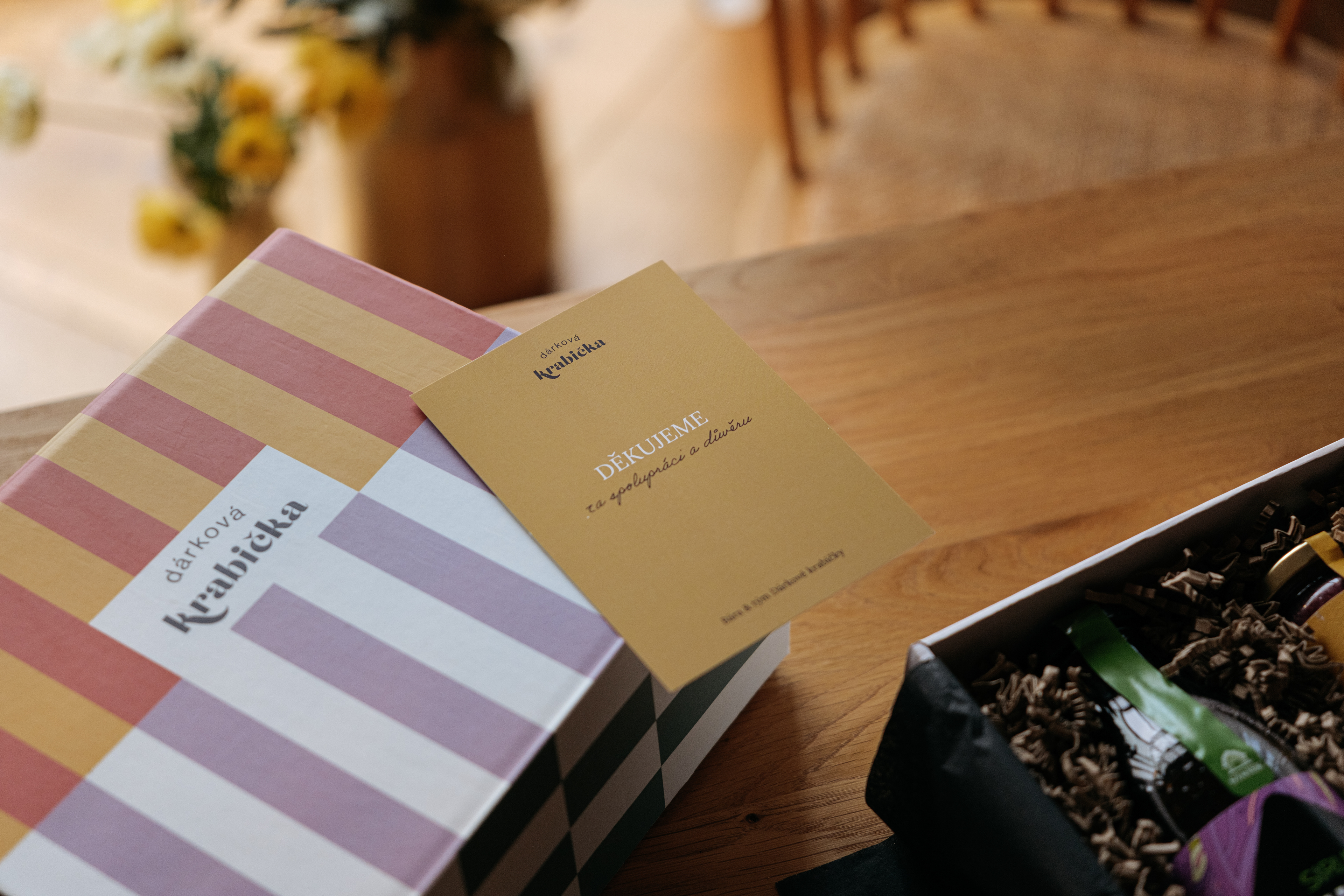
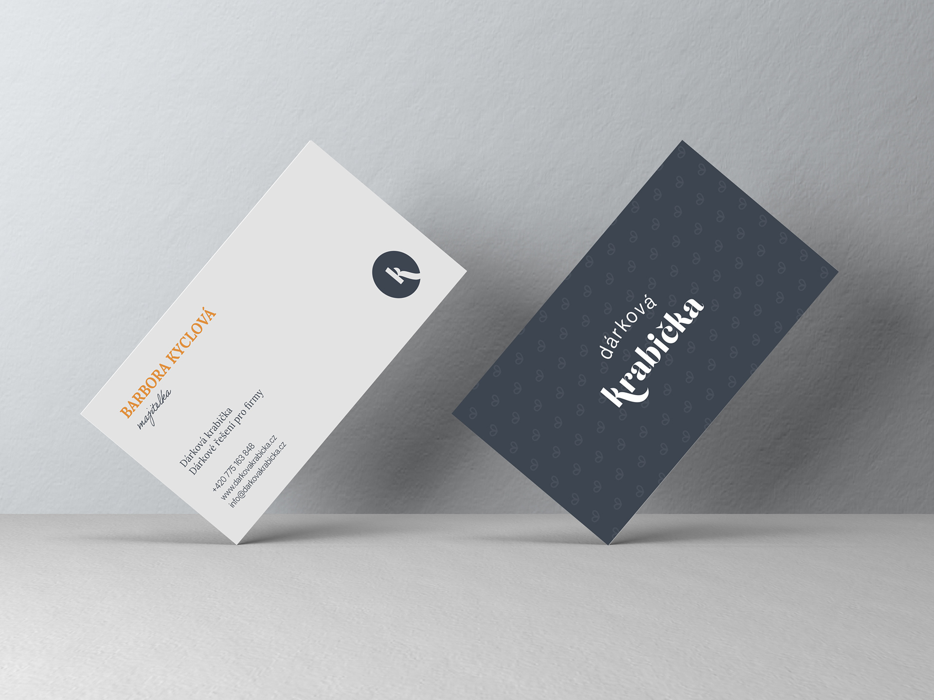
Dárková krabička is a family-run Czech business built around a simple idea: making gifts feel personal. This project was especially close to my heart. I worked on evolving the brand into a more mature and confident visual identity, while keeping the warmth, honesty and human touch that had always been at its core. The new logo reflects that balance. The clean serif typography gives the brand a more timeless and established character, while the small bow symbol keeps a direct connection to gifting and to the original warmth of Dárková krabička. It is simple, recognisable and playful without feeling childish. From the identity and packaging to digital and print, the aim was never to make the brand feel bigger or more corporate. Just more grown-up, considered and recognisably itself.